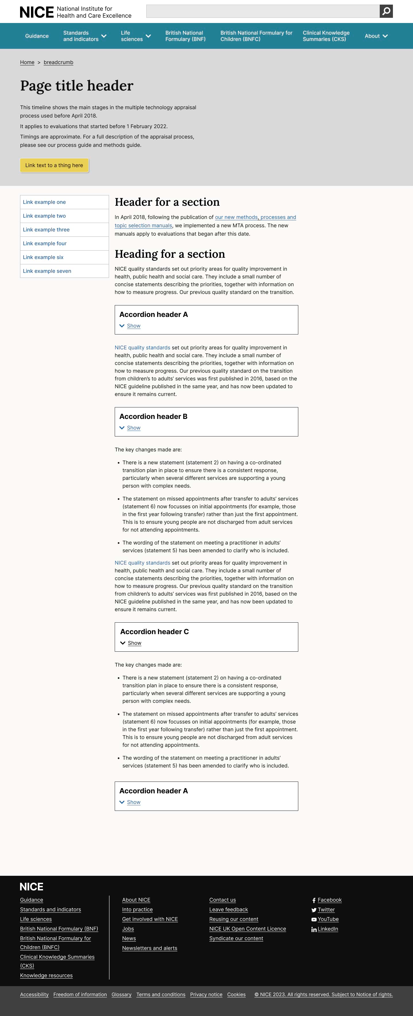
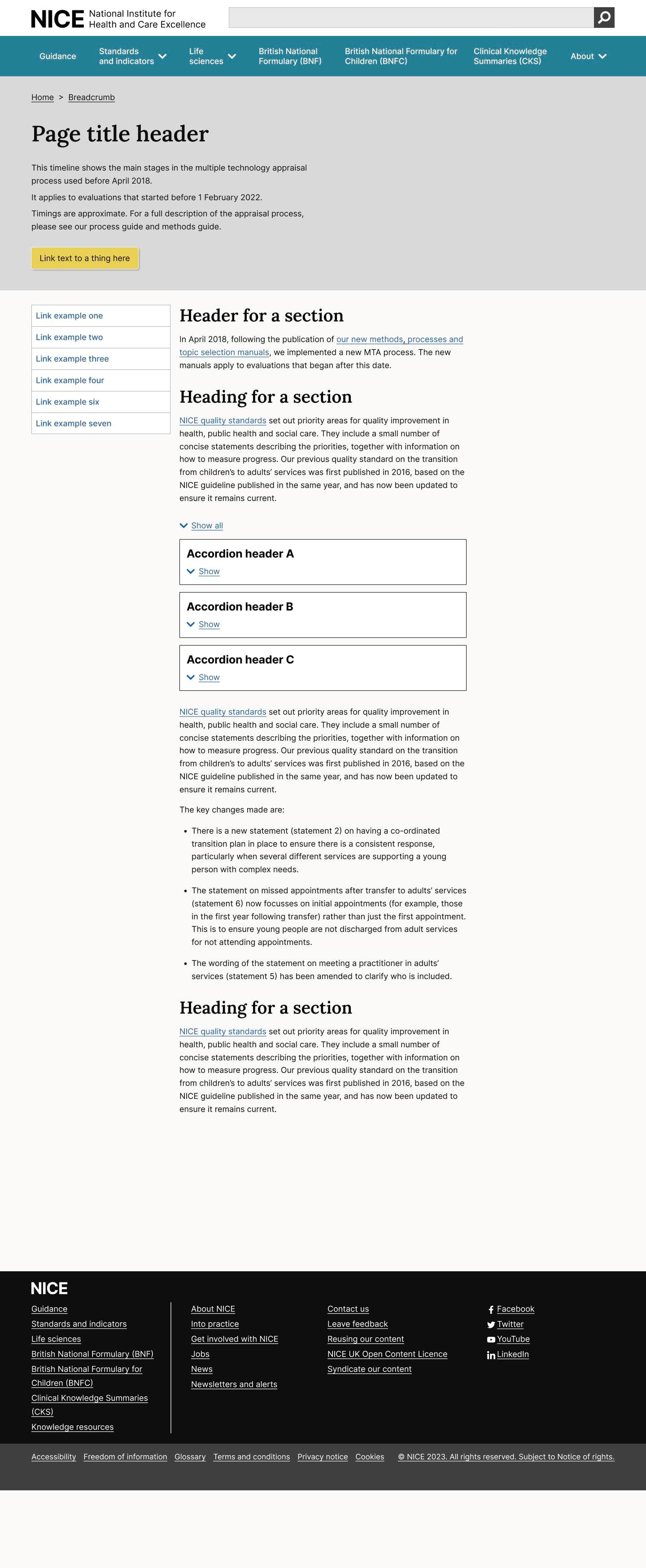
Accordion
The accordion component lets users show and hide related content sections on a page.
When to use
Only use an accordion if there’s evidence it’s helpful for the user to:
-
see an overview of multiple related sections of content.
-
choose to show and hide sections that are relevant to them.
-
look across information that might otherwise be on different pages.
For example, an accordion can work well if the user needs to reveal and compare information that’s relevant to them.
Accordions can also work well for people who use a service regularly.
Test with users to decide if using an accordion outweighs the potential problems with hiding content.
When not to use
Accordions are often overly used within content, seen as an easy way to organise content. However, accordions hide content from the user; not everyone will notice or understand how they work.
-
Do not use an accordion for content that all users need to see.
-
Only use an accordion if there's evidence it's helpful for the user.
-
On pages where users find the amount of information overwhelming
-
Breaks down information into bite-size pieces which the user can "Show all" when they're ready to do so.
-
When you do not see a clear user need for them
How to use
Write the heading like any other button text. Use sentence case, describe the content that will show, and keep it short.
Users of screen readers might find it challenging to navigate the accordion if the button text is too long.
Organise accordion sections that make sense to users based on their needs.
You can choose from the default single accordion, a caution accordion or grouped accordions.
Default accordion
Callout accordion
Example: Callout accordion
Caution accordion
Example: Caution accordion
Accordion with Heading
Example: accordion with heading
Inner content of accordion
Accordion Group
Example: Accordion group
Accordion 1 body
Accordion 2 body
Accessibility
Component meets WCAG AA guidelines for accessibility on:
Text contrast - Text has a contrast ratio of at least 4.5:1 for small text and at least 3:1 for large text (WCAG 2.0 )1.4.3).
UI contrast - Visual information required to identify components and states (except inactive components) has a contrast ratio of at least 3:1 (WCAG 2.1 1.4.11).
Accessible use of colour: Colour is not used as the only visual means of conveying information (WCAG 2.0 1.4.1).
ARIA attributes and button use:
The toggle button uses the aria-expanded attribute to indicate whether the content is visible (true) or not (false).
The aria-controls attribute is used to associate the button with the content it controls.
Use of a button element ensures that the accordion can be triggered by keyboard users and screen reader users.
Research/evidence
No research done on the component at this time
Help improve this page
To help make sure that this page is useful, relevant and up to date, you can:
Need help?
If you've got a question about the NICE Design System, contact the team.
- If you work for NICE, ask us a question in our Teams channel
- If you work outside of NICE, you can get in touch with us via Github discussions