Hero
Hero components introduce a site or page with impact. They inform people where they are and how we can help them.

When to use
Use it as the first thing on a page to introduce a site or section of a site. Hero components use images to add visual interest and emphasise and reinforce brand values.
Check there is a need to use a Hero image to introduce the page. There are pros and cons to this approach. Nielsen/Norman talk about the pros and cons of using large background images in their article: Image-focused Design: Is Bigger Better?
“Compelling images have a unique ability to inspire and engage your audience. In his book, Emotional Design, Don Norman described the powerful, visceral responses people can have to visual appearance. Websites can elicit positive visceral responses from people by displaying aesthetically pleasing images.”
But visceral appeal is not the only requirement for a good user experience. Websites also need to deliver content and functionality to users. Getting people's attention with attractive images certainly has value, but comes at the price of making other elements harder to see and use.”
When not to use
Don’t use a hero unless there is a need to add extra visual interest or emphasis. There's a risk that images can distract from content placed above or alongside it. They shouldn't be used for content that users need to read through in detail or clinically important content such as guidance information.
Use the page header [link to page header] as a simplified way to introduce pages without images.
Don’t use the hero outside of the top of the page. Use the action banner, alerts or panels to highlight or promote content outside of the top of the page.
How to use
The hero component is flexible, combining images, colours, text and calls to action.
Default
The hero will always contain a title, intro, and image. There is also an optional description and call to action.

Call to action button (optional)
A call to action button is recommended as a way to direct people to important information but not mandatory.

Breadcrumb (optional)
The breadcrumb should be used unless on the homepages or bespoke landing page where a breadcrumb isn’t suitable.
Brand image
- Images appear on the right-hand third in the NICE brand ‘slash’.
- Images are removed on mobile and tablet views.
- Images should follow the brand guidelines for photography and illustration.
- Images should be cropped and compressed.
- Use appropriate alt text to describe the image.
Minimum height
The hero has a minimum height of 300px on desktop devices to ensure the image is usable.
Mobile image variant
Images are removed on mobile and tablet views.

Colour variations
Subtle (default)
Background colour: #EEEAE4, text colour: #0e0e0e
Bold
Background colour: #00436C, text colour: #ffffff

Optimizing images
It's important to optimise images for the web before they are used.
Resizing
Resize the image so that it is no bigger than the largest size at which it will be displayed in the browser. This can be found by inspecting the width of the image's container - make the width of the image the same value, while keeping the aspect ratio intact.
Compression
Images should also be compressed. We need to use formats that have widespread browser support, which means exporting images as JPEGs or PNGs.
PNGs are well suited to small images with very few colours (logos and icons, for example).
JPEGs are better for almost everything else and are the most likely to be used with the full-bleed variant.
Use a tool such as Squoosh to resize images and experiment with different compression settings in order to reduce the file size as much as possible. While compressing a JPEG image in Squoosh, try moving the Quality slider around and observe the results - we're aiming for the lowest possible quality value that still produces an acceptably clear output.
Accessibility
Component meets WCAG AA guidelines for accessibility on:
Text contrast - Text has a contrast ratio of at least 4.5:1 for small text and at least 3:1 for large text (WCAG 2.0 )1.4.3).
UI contrast - Visual information required to identify components and states (except inactive components) has a contrast ratio of at least 3:1 (WCAG 2.1 1.4.11).
Accessible use of colour - Colour is not used as the only visual means of conveying information (WCAG 2.0 1.4.1).
Any images should contain appropriate alt text.
Examples
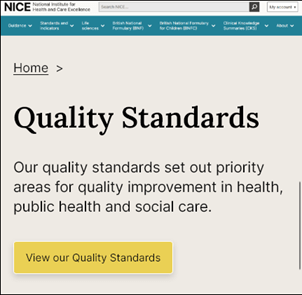
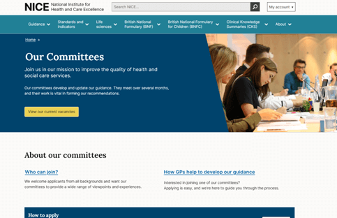
With brand image on category landing page:
Help improve this page
To help make sure that this page is useful, relevant and up to date, you can:
Need help?
If you've got a question about the NICE Design System, contact the team.
- If you work for NICE, ask us a question in our Teams channel
- If you work outside of NICE, you can get in touch with us via Github discussions