Button
Use buttons when users need to trigger an action.
Introduction
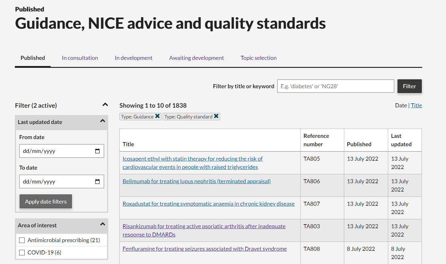
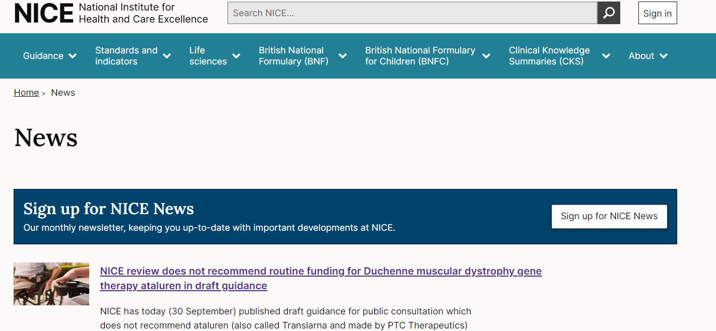
Buttons are large clickable elements that make it clear to users what actions can be taken on a page. There are 4 styles of buttons available to use:
- Call to action (CTA)
- Primary
- Secondary
- Inverse
When to use
Buttons are used to trigger an action on a page - for example apply a filter, run a search query or move to another page through a link.
When not to use
Don't use buttons for links inside headings, paragraphs or blocks of text.
How to use
Content guidelines
Buttons should clearly describe what action the user takes when they click it. Examples include:
- Download guidance
- Filter results
- Sign out
Use sentence case - only capitalise the first letter. For example 'Filter results' not 'Filter Results'.
Button text needs to make sense on its own; avoid vague text such as 'More' or 'Click here'.
Button basics
- Use the correct semantics for the button element - buttons can be
<a>for links,<button>for actions or<input type="submit">for form submissions. - Ensure that prominent buttons are displayed in a easy to spot location.
- Place buttons in a sensible order.
- Make it harder to find destructive buttons (e.g. Cancel, Delete).
Call to action (CTA) button
Example: CTA button
Used for the main call to action on a page. Don't use more than one CTA button on a page. Having more than one main call to action reduces their impact, and makes it harder for users to know what to do next.
The CTA button is for actions that are a clear priority on the page - form submissions, primary navigation links. Think about the action in relation to the overall goal of the page. Some actions are important but not the main focus of the page and so the secondary button might be more appropriate.
Primary button
Example: primary button
For actions that need less prominence than a CTA button. Examples include:
- A secondary action on a page following a CTA button.
- A page with two actions of equal importance, where it would be inappropriate to give extra emphasis to one action with a CTA button.
- Where a CTA button would distract from the main goal or content of the page.

Secondary button
Example: secondary button
For actions that need less prominence than a primary button. Examples include:
- A secondary action on a page following a primary button.
- A page with two actions of equal importance, where it would be inappropriate to give extra emphasis to one action with a Primary button.
- Where a primary button would distract from the main goal or content of the page.
Inverse button
Example: inverse button
To be used as an alternative option on dark backgrounds where other button colours won't give sufficient contrast. UI elements (Buttons) should have a 3:1 contrast ratio to the surrounding background colour. You can use a contrast checker to check values:


Accessibility
Write descriptive button text that describes what the button will do. Button text needs to make sense on it's own when read by assistive technology such as a screen reader. Use visually hidden text to add context for assistive technologies in cases where this can't be added to the button visually.
Contrast checks
Component passes AA contrast ratio for text: Yes
Component pass AA contrast ratio for UI elements: Yes
Research/evidence
We A/B tested variations of the button design and found the design with a shadow and rounded corners performed best. This was implemented in the design.
Help improve this page
To help make sure that this page is useful, relevant and up to date, you can:
Need help?
If you've got a question about the NICE Design System, contact the team.
- If you work for NICE, ask us a question in our Teams channel
- If you work outside of NICE, you can get in touch with us via Github discussions
