Container
Wrap page content inside a container to ensure consistent margin and width settings across screen sizes.
What is it?
A container is an empty <div> component that you fill with content. Containers have pre-set margin and width settings that centre content on the page.
Containers help to make the site work across different devices and screen sizes. They keep content centred on the page across large screen sizes by adding a max-width of 73.125rem.
When to use
All pages should be inside some sort of container element, however some existing templates and site sections such as the Footer, header and global nav have margin and width settings already built in so the container isn't needed.
Use if you need to make page content align with the fixed website elements such as the global nav and footer.
You should use a container to wrap content inside the full bleed component [link]. Without a container content won't align with surrounding content.
Full bleed without a container
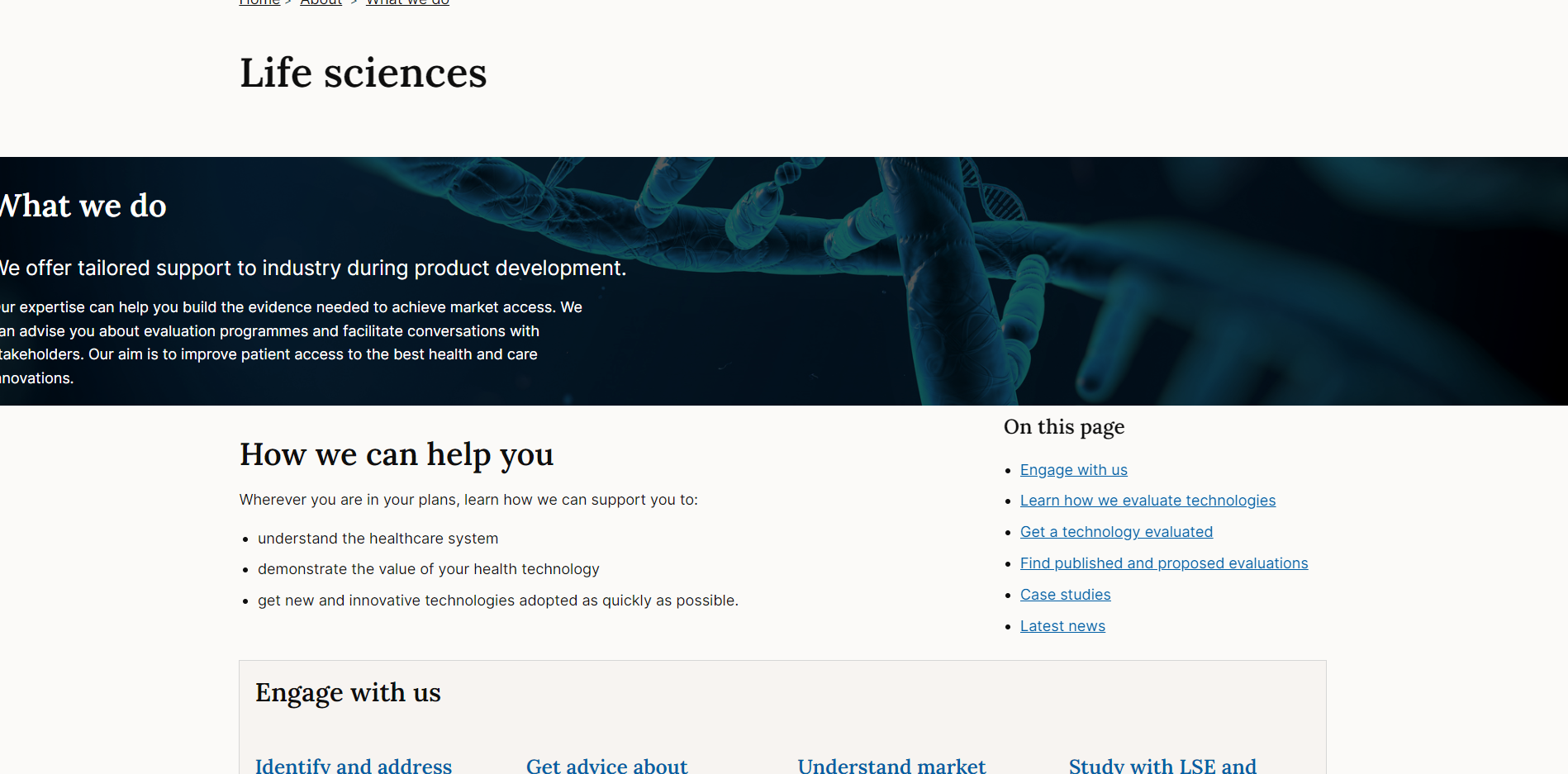
Full bleed with container inside
When not to use
Don't put a container inside another container.
Some parts of the site, such as the corporate pages of the website, use page templates that have margin and width settings already applied so the container is not needed.
How to use
Default container
Full width container
The full width option overrides the default max-width of the container and sets it to 98% of the parent element's width.
Accessibility
Component meets WCAG AA guidelines for accessibility on:
- Text contrast - Text has a contrast ratio of at least 4.5:1 for small text and at least 3:1 for large text (WCAG 2.0 )1.4.3).
- UI contrast - Visual information required to identify components and states (except inactive components) has a contrast ratio of at least 3:1 (WCAG 2.1 1.4.11).
- Accessible use of colour - Colour is not used as the only visual means of conveying information (WCAG 2.0 1.4.1).
Research and evidence
No research done on the component at this time.
Help improve this page
To help make sure that this page is useful, relevant and up to date, you can:
Need help?
If you've got a question about the NICE Design System, contact the team.
- If you work for NICE, ask us a question in our Teams channel
- If you work outside of NICE, you can get in touch with us via Github discussions