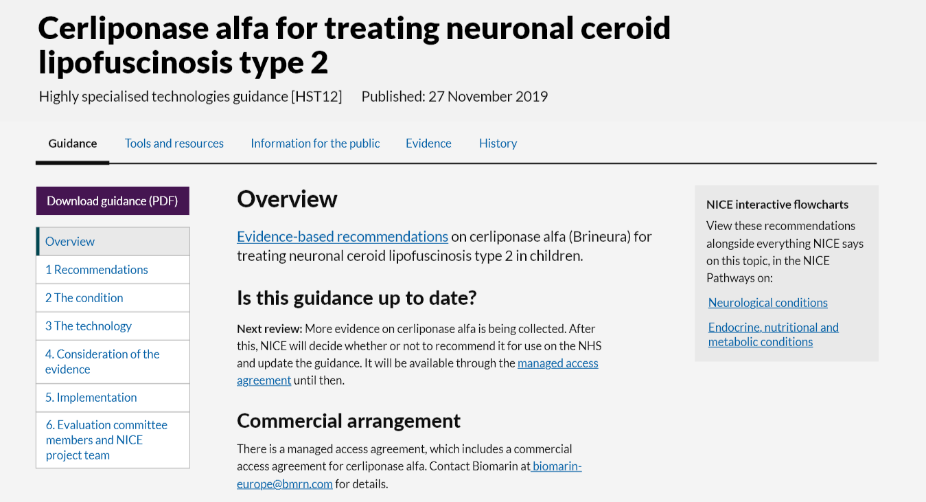
Horizontal Nav
A menu to navigate to different pages.
When to use
The Horizontal navigation allows users to see at a glance what navigation options are available. It is best used in situations where:
- Maximum amount of space is needed for content.
- Primary and secondary navigation needed.
Maximum amount of space is needed for content
Horizontal navigation sits above the content. This means the whole width of the page is available for content underneath. This compares to the stacked navigation component which sits alongside content and takes up a portion of the content area.
Primary and secondary navigation needed
Horizontal navigation is useful to use as a primary navigation component, sitting above content that also needs secondary navigation. The Horizontal nav sits above content which implies a higher position in the content hierarchy,
When not to use
Don't use when:
- There are lots of links in the navigation
- There are long navigations links
- The menu structure could grow in future beyond the width of the screen.
Horizontal navigation is limited by the amount of space across the screen. For this reason it doesn't work as well in situations where the navigation items take up lots of horizontal space or the navigation isn't clearly defined and could grow in future.
Don't use when you should use tabs
Use tabs to switch between related content on the same page. Horizontal navigation should be used to move between different pages of content.
Use tabs to alternate between views within the same context, not to navigate to different areas. This is the single most important point, because staying in place while alternating views is the reason we have tabs in the first place.
How to use
Positioning

The Horizontal navigation should appear above the content it relates to.
Content
Avoid long link text. Link text should be as simple as possible, one or two words.
Use 5-6 links maximum. On desktop the Horizontal navigation shouldn't be wider than the screen width.
Ordering of links
Links should be ordered left-right in order of importance/usefulness. Most useful link first/left, least useful last/right.
Accessibility
Link text should be descriptive - it should explain where the user will be taken to.
Tap targets meet minimum size requirements (44 x 44 px).
Component meets WCAG AA guidelines for accessibility on:
- Text contrast - Text has a contrast ratio of at least 4.5:1 for small text and at least 3:1 for large text (WCAG 2.0 )1.4.3).
- UI contrast - Visual information required to identify components and states (except inactive components) has a contrast ratio of at least 3:1 (WCAG 2.1 1.4.11).
- Accessible use of colour - Colour is not used as the only visual means of conveying information (WCAG 2.0 1.4.1).
Research/evidence
We conducted click tests to sense check the pattern made sense to users.
Users were given a task to navigate to content in a design featuring the Horizontal navigation.
7/10 users clicked the correct navigation element with the first click.
Help improve this page
To help make sure that this page is useful, relevant and up to date, you can:
Need help?
If you've got a question about the NICE Design System, contact the team.
- If you work for NICE, ask us a question in our Teams channel
- If you work outside of NICE, you can get in touch with us via Github discussions
