In-page Nav
Allow users to navigate to specific sections within long pages of content.
Overview
In-page navigation jumps users down the page after clicking a link. It's a way to quickly access content further down the page without manually scrolling.
It also acts as a content list, allowing users to understand the content on the page.
When to use
In-page links are useful to people who need to find information on long content pages. The longer the page, the more beneficial it is.
Before adding in-page links to make a longer piece of content more manageable, consider if the content could be shortened, reorganized or rewritten. The menu isn't a substitute for well-structured and relevant content.
When not to use
Don't use In page navigation to link out to other pages. It is to be used for linking to elements on the same page.
Use other navigation menus, such as stacked navigation or horizontal navigation, for menus that link to separate pages.
Don't use it on short pages with only one or two short sections, where the effort needed to scroll is minimal. The extra effort needed to load the menu and for users to process the menu isn't worth the time it would save from scrolling the page manually.
How to use
With a heading
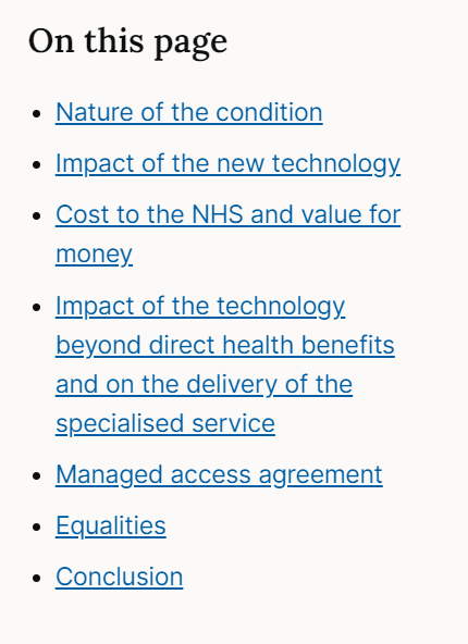
Make sure to include a heading above the in-page links that explains what they are. This helps to reduce confusion around where the links will take the user. If you're using the React component, the "On this page" heading will be added for you.
Positioning
The in-page navigation sits on the right-hand side of the page on large screen sizes. It stacks below the main page title and above the main page content on mobile devices and small screens.
The menu should sit outside other content, such as hero elements, panels, full bleed and alerts.
No-scroll variant
If you don't want the menu to be sticky (i.e. scroll along with the page), you can use its noScroll variant. This is useful if you want a list of links to sit directly above other content, for example in the main body of the page.
Two columns
If you're using the no-scroll variant, you can also choose to render the menu in two columns instead of one.
Content
The menu uses headings from the page to generate link text. This is to ensure the link and the content match up. It helps to reassure users that they have been moved to the right part of the page.
Ensure headings are clear and concise. These act as a reference point for what the content is and where they will take the user.
Include heading levels
The menu can be customised to include different heading levels. By default, it will display second-level Heading 2 and third-level Heading 3.
Change default heading levels
On some pages, you will need to change the level of headings displayed in the menu.
Pages with lots of headings and subheadings result in the menu being very long, which can make it hard to process. The menu is intended as a quick overview of the page content, not a full page map. We don't want to overload the user with too much information.
In these case, we would restrict the menu to just show one heading level.
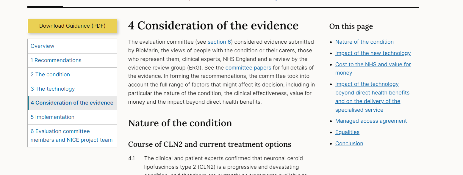
For example, on guidance pages, there are lots of H2s and H3s, which results in the menu being too long and hard to process. On these pages, we only show a Heading 2.
HTML settings reference
The basic version of the in-page-nav only requires the below data attribute to initialise on the page, with the default settings, which can be overridden with data attributes.
Available settings
| Option | Data Attribute | Description | Default | Example |
|---|---|---|---|---|
| Headings container selector | data-in-page-nav-headings-container-selector | This is a CSS-style selector for the scope of the page that you want the in-page-nav to use as its context. | main | <div data-in-page-nav data-in-page-nav-headings-container-selector='.my-container'></div> |
| Headings to include | data-in-page-nav-headings-selector | Control for which headings you'd like to be included in the navigation. Defaults to h2 and h3. | h2, h3 | <div data-in-page-nav data-in-page-nav-headings-selector='h4, h5'></div> |
| Headings to exclude | data-in-page-nav-headings-exclude-selector | Any CSS-style selectors you'd like to exclude. | none | <div data-in-page-nav data-in-page-nav-headings-exclude-selector='.exclude-me-from-nav'></div> |
| Container to exclude | data-in-page-nav-headings-exclude-container | A CSS-style selector that will exclude any headings contained within it. | none | <div data-in-page-nav data-in-page-nav-headings-exclude-container='.exclude-everything-in-me-from-nav'></div> |
| Scroll tolerance | data-in-page-nav-scroll-tolerance | This is a pixel value to determine how close to the top of the viewport a heading has to be in order to be considered "active" and therefore highlighted. | 50 | <div data-in-page-nav data-in-page-nav-scroll-tolerance='100'></div> |
| No scroll | data-in-page-nav-no-scroll | A boolean (i.e. true/false) value that will determine whether to show the no-scroll variant | false | <div data-in-page-nav data-in-page-nav-no-scroll='true'></div> |
| Two columns | data-in-page-nav-two-columns | A boolean (i.e. true/false) value that will determine whether to show the two columns variant | false | <div data-in-page-nav data-in-page-nav-two-columns='true'></div> |
Accessibility
Component meets WCAG AA guidelines for accessibility on:
- Text contrast - Text has a contrast ratio of at least 4.5:1 for small text and at least 3:1 for large text (WCAG 2.0 )1.4.3).
- UI contrast - Visual information required to identify components and states (except inactive components) has a contrast ratio of at least 3:1 (WCAG 2.1 1.4.11).
- Accessible use of colour - Colour is not used as the only visual means of conveying information (WCAG 2.0 1.4.1).
Research and evidence
No research done on the component at this time.
Help improve this page
To help make sure that this page is useful, relevant and up to date, you can:
Need help?
If you've got a question about the NICE Design System, contact the team.
- If you work for NICE, ask us a question in our Teams channel
- If you work outside of NICE, you can get in touch with us via Github discussions