Stacked nav
A way for users to navigate between sub-pages within guidance, a topic or section of content.
Overview
Use stacked navigation to allow users to navigate through pages within a section, topic or product.
For example - moving between pages in a guidance product, or moving between pages in a Clinical Knowledge Summaries topic.
The stacked navigation connects sub-pages, allowing users to move to any sub-page from any other sub-page.
When to use
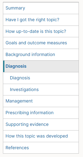
Use when there are multiple pages on the same content level underneath a higher topic or product. A good example is a Clinical Knowledge Summaries topic. Each topic has different pages (diagnosis, management, prescribing) that people need to move between.
When not to use
Don't use the stacked navigation for jumping users down a page - use On page navigation for this.
Don't use as a high level menu to select a product, topic or guidance. Use the A-Z list, column list or grid list for this.
How to use
Example stacked nav
Use in combination with breadcrumbs.
Always position to the left of the interface to maintain consistency.
Try to keep navigational links short.
Links should match the name of the page they link to.
Always use an active link to display what page the user is on.
Use aria-current="page" to highlight the current page.
Use aria-label="navigation name" or aria-labelledby="id-here" on the root nav element.
Stacked nav expands to fill the available space, so usually wrap in a grid.
Sub navigation
The menu supports an additional level of navigation underneath the pages in the menu. The second level navigation is indented to show it sits underneath a page:
Accessibility
Component meets WCAG AA guidelines for accessibility on:
- Text contrast - Text has a contrast ratio of at least 4.5:1 for small text and at least 3:1 for large text (WCAG 2.0 )1.4.3).
- UI contrast - Visual information required to identify components and states (except inactive components) has a contrast ratio of at least 3:1 (WCAG 2.1 1.4.11).
- Accessible use of colour - Colour is not used as the only visual means of conveying information (WCAG 2.0 1.4.1).
Research and evidence
No research done on the component at this time.
Help improve this page
To help make sure that this page is useful, relevant and up to date, you can:
Need help?
If you've got a question about the NICE Design System, contact the team.
- If you work for NICE, ask us a question in our Teams channel
- If you work outside of NICE, you can get in touch with us via Github discussions