A to Z List
A to Z list panels are a container for a group of links associated with a letter of the alphabet.
Overview
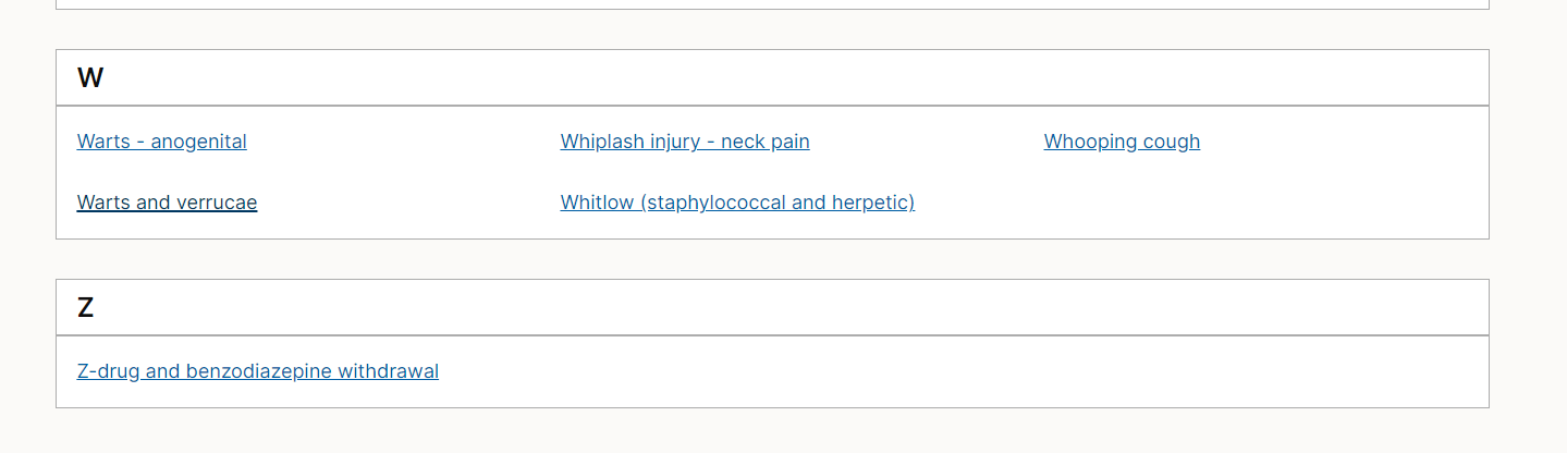
A to Z lists panels group together links associated with a letter of the alphabet. For example, all links starting with the letter A. They work alongside the alphabet component to create A to Z navigation pages. These pages present a number of links in an alphabetical list so users can find and navigate to the content they need.
When to use
A to Z list panels should be used when there are a number of links that can be grouped together by different letters. We currently use the A to Z pattern in these areas of the NICE website:
When not to use
Do not use the A to Z list panels for links or groups of links that are not split up by letters in alphabetical order. The column list can be used as a generic container for grouping links on a navigation page. It has similar styling to the A to Z list panel but without the letter heading at the top of the container.
How to use
The panels should sit below the alphabet component.
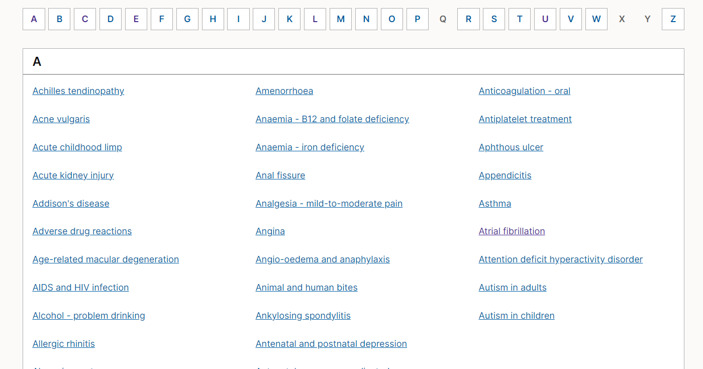
Links sit in alphabetical order across 3 columns starting with the top left column, Links flow down a column before moving to the next column. The panels stack down the page in alphabetical order. If there are no links associated with a letter then the panel isn't created.
Accessibility
Component meets WCAG AA guidelines for accessibility on:
- Text contrast - Text has a contrast ratio of at least 4.5:1 for small text and at least 3:1 for large text (WCAG 2.0 1.4.3).
- UI contrast - Visual information required to identify components and states (except inactive components) has a contrast ratio of at least 3:1 (WCAG 2.1 1.4.11). Accessible use of color - Color is not used as the only visual means of conveying information (WCAG 2.0 1.4.1).
Research/evidence
We A/B tested the A to Z list panel in October 2022.
We tested 2 versions of a single column list design against the current 3 column list. We ran the test across 3 different A-Z list pages on the BNF website:
- Drugs
- Interactions
- Treatments summaries.
Overall, the 3 column design performed better for both:
- the time taken to click a link
- the click through rate (how many people clicked a link on the page).
However, the single column list performed better on the Treatment summaries A-Z list. Our assumption is because this was a much shorter list. As a result of the test, the current 3 column list has remained unchanged. We could look to support shorter A-Z lists with a single column variant in future.
Help improve this page
To help make sure that this page is useful, relevant and up to date, you can:
Need help?
If you've got a question about the NICE Design System, contact the team.
- If you work for NICE, ask us a question in our Teams channel
- If you work outside of NICE, you can get in touch with us via Github discussions