Alphabet
Display a horizontal A-Z list with optional links
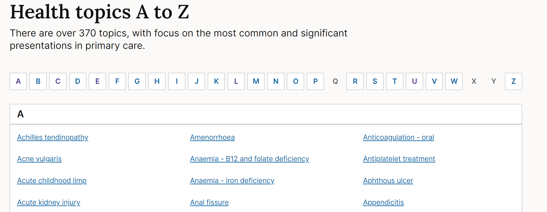
The alphabet component is a horizontal list of letters (A-Z) that jumps users to a container with links associated with that letter.
It usually works alongside A to Z list panels that contain the links to different pages grouped by letter.
We currently use the A to Z pattern in these areas of the NICE website:
When to use
The alphabet component is used:
- at the top of A to Z list pages. These pages present a number of links in an alphabetical list so users can find and navigate to the content they need.
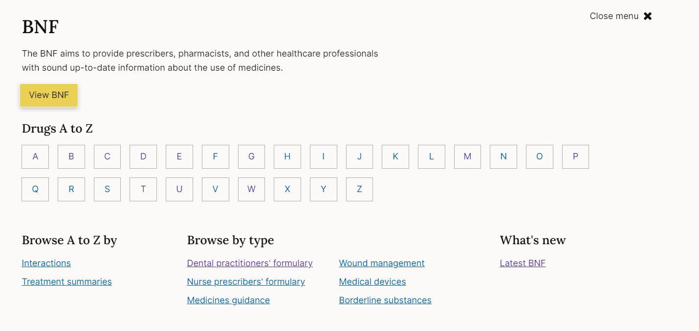
- as a way of navigating into A to Z list pages from elsewhere, for example on the BNF homepage.
When not to use
Do not use with other types of links or lists of links, the alphabet should only be used for links for letters of the alphabet.
How to use
On A-Z list page the alphabet component should be placed at the top of the page above the A to Z list panels.
The component can also be used on its own as a navigation route into A to Z list pages, for example in the BNF mega menu:
Basic variant
Chunky variant
The chunky variant of the alphabet uses a slightly larger font size and more padding for when the alphabet should carry more visual weight.
Accessibility
Component meets WCAG AA guidelines for accessibility on:
- Text contrast - Text has a contrast ratio of at least 4.5:1 for small text and at least 3:1 for large text (WCAG 2.0 )1.4.3).
- UI contrast - Visual information required to identify components and states (except inactive components) has a contrast ratio of at least 3:1 (WCAG 2.1 1.4.11).
- Accessible use of color - Color is not used as the only visual means of conveying information (WCAG 2.0 1.4.1).
Research/evidence
No research done on the component at this time
Help improve this page
To help make sure that this page is useful, relevant and up to date, you can:
Need help?
If you've got a question about the NICE Design System, contact the team.
- If you work for NICE, ask us a question in our Teams channel
- If you work outside of NICE, you can get in touch with us via Github discussions