Action Banner
A banner for highlighting, and giving context to, a call-to-action.
When to use
Use action banners to provide a call to action with context, particularly when drawing attention to the key call to action on the page. They can also be used to break up a page layout and give visual interest.
When not to use
Don't use for large blocks of content. An action banner is designed as a short interruption on the page to call attention to a key action or goal. There should be a short heading and one or two sentences of content maximum.
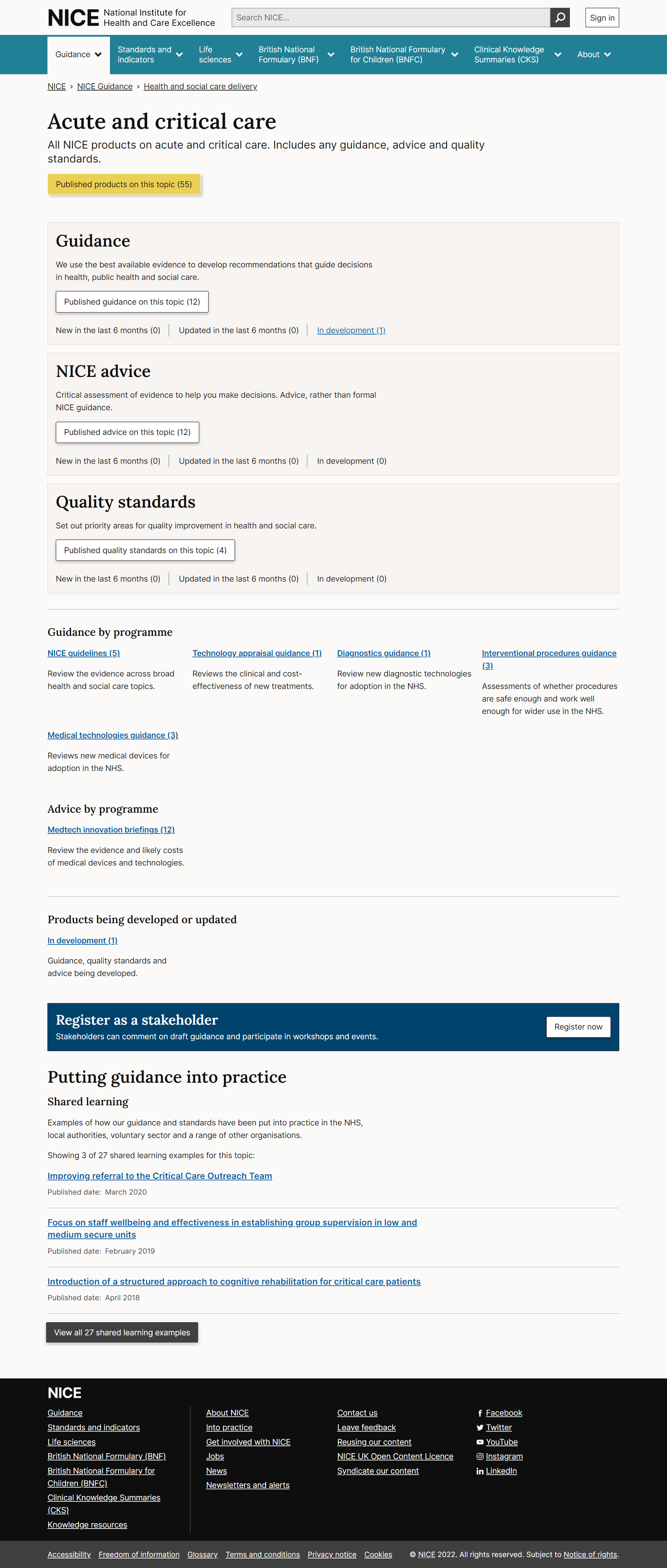
An example of the banner to call attention to registering as a stakeholder. There is a short heading and just one sentence of supporting text.
If you need to highlight or emphasise larger blocks of content use the panel component.
For warning, error or caution messages use the alert component.
How to use
Use sparingly, with a maximum of 1 per page.
Don't use within a container component. Action banners fill the available horizontal space and have their own built-in container. They usually live outside of any .container to fill the screen width.
The action should be a button: choose the right type of button (primary, secondary etc) to match the call to action importance. Follow the rules for buttons.
Default action banner
Example: default action banner
The default variant is strong and grabs users' attention. Use sparingly for important calls of action on a page that need extra context. Can be used with an inverse button - .btn.btn--inverse or with a call to action button - .btn.btn--cta for extra impact.
Subtle action banner
Example: subtle action banner
Use the subtle variant when you need a call to action with context, but don't want to distract users. For example giving feedback on a page. Use with a primary .btn.btn--primaryor secondary - .btn.btn--secondary button.
Full width action banner
Example: full width action banner
The full-width action banner spans the full width of the browser window and adds an image to the side of the content.
It can be used to break up a page layout - breaking out of the standard page container or to complement other full-width elements such as the full-bleed panels that are used on the homepage.
The full width banner contains:
- a short heading (H2)
- descriptive text for extra context (lead text)
- an image
- a button
Images
Images should follow the brand guidelines for photography and illustration.
Use appropriate alt text to describe the image.
Mobile
Images will stack above the content in the banner on mobile devices.
Example: full width action banner (with image)
Example: full width subtle action banner (with image)
Example: full width subtle action banner
Accessibility
Component meets WCAG AA guidelines for accessibility on:
- Text contrast - Text has a contrast ratio of at least 4.5:1 for small text and at least 3:1 for large text (WCAG 2.0 1.4.3).
- UI contrast - Visual information required to identify components and states (except inactive components) has a contrast ratio of at least 3:1 (WCAG 2.1 1.4.11).
- Accessible use of colour - Colour is not used as the only visual means of conveying information (WCAG 2.0 1.4.1).
Research/evidence
No research done on the component at this time
Help improve this page
To help make sure that this page is useful, relevant and up to date, you can:
Need help?
If you've got a question about the NICE Design System, contact the team.
- If you work for NICE, ask us a question in our Teams channel
- If you work outside of NICE, you can get in touch with us via Github discussions