Full Bleed
A component that makes the content within span the full width of the page.
Overview
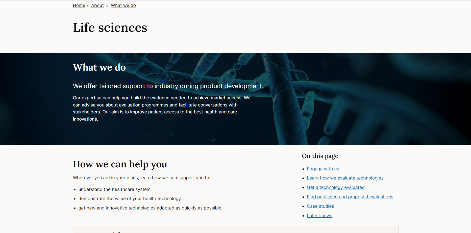
This component can be used as a major separator or header to create impact.
It expands out of any container to span the full width of the screen, and is typically used with a background image or colour.
When to use
Full bleed components draw attention to the elements inside, use them for promotional or marketing style content that require extra interest or visual impact.
Nielsen/Norman talk about the pros and cons of using large background images in their article: Image - Focused Design: Is Bigger Better?
“Compelling images have a unique ability to inspire and engage your audience. In his book, Emotional Design, Don Norman described the powerful, visceral responses people can have to visual appearance. Websites can elicit positive visceral responses from people by displaying aesthetically pleasing images.”
But visceral appeal is not the only requirement for a good user experience. Websites also need to deliver content and functionality to users.
Deciding which approach is best for your website is a matter of prioritization. In most cases a webpage has multiple goals and multiple audiences. Getting people's attention with attractive images certainly has value, but comes at the price of making other elements harder to see and use.”
When not to use
There's a risk that background images and colours can distract from content placed above it. They shouldn't be used for content that users need to read through in detail or clinically important content such as guidance information.
How to use
Default
The basic settings make the Div span the full page width:
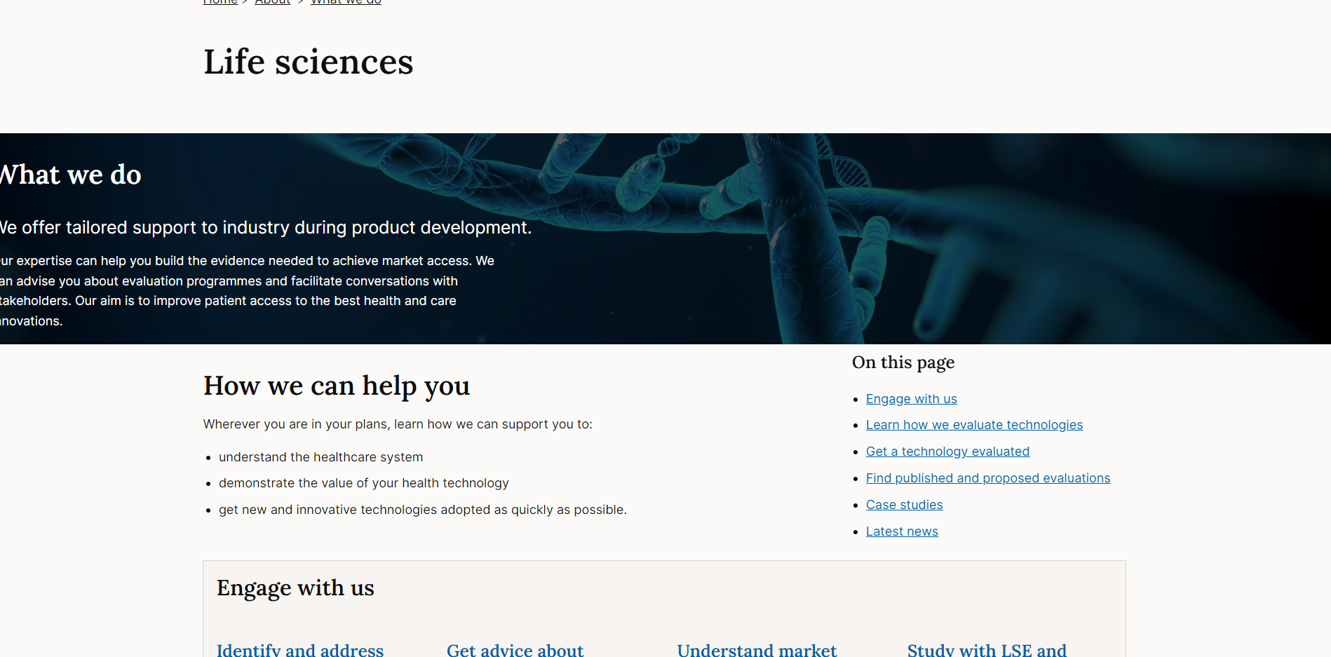
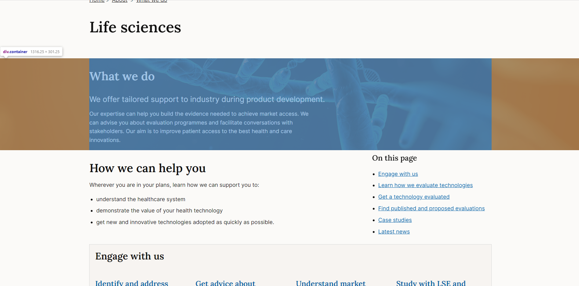
Centre content inside
Use with a container element to ensure that any content inside the full bleed component aligns with other content on the page.
The container adds side margin that centres the content:
Other spacing options
If you don't want to use the container for centering the content, you could use spacing classes to manually add padding to a div element.
For example adding class=”ph--g” will add 4rems of padding to the side of a <div>

Background colour
Default
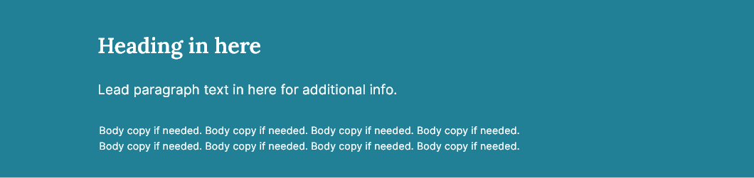
By default the component has a teal background (#228096) with white text (#fff).
Light
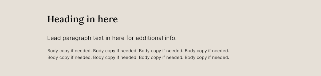
The light variant will change the background colour to #E6E0D7 and text to black (#0e0e0e) if no background image is present:
Dark
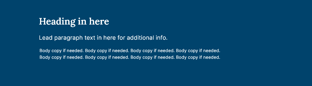
The dark variant will change the background colour to #00436C and the text to #fff if no background image is present:
Transparent

The transparent variant will remove the background colour and change the text colour to black (#0e0e0e) if no background image is present:
With background image
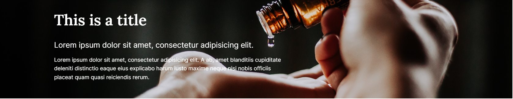
Dark background image
The dark background image variant will add a dark overlay on the background image and change the text colour to white (#fff):
Light background image
The light background image variant will add a light overlay on the background image and change the text colour to black (#0e0e0e):
Using background images
Background images should not contain text. Text should be added as HTML inside the full bleed container.
Make sure any text used over the top of the background image can be read: https://www.nngroup.com/articles/text-over-images/ . This might involve editing the image before adding to the page.
Check text and image contrast levels
Background images re-size on different devices and screen sizes - you can't guarantee what parts of the image will be visible at any given time so keep this in mind.
Optimizing images
It's important to optimise images for the web before they are used.
Resizing
Resize the image so that it is no bigger than the largest size at which it will be displayed in the browser. This can be found by inspecting the width of the image's container - make the width of the image the same value, while keeping the aspect ratio intact.
Compression
Images should also be compressed. We need to use formats that have widespread browser support, which means exporting images as JPEGs or PNGs.
PNGs are well suited to small images with very few colours (logos and icons, for example).
JPEGs are better for almost everything else and are the most likely to be used with the full bleed component.
Use a tool such as Squoosh to resize images and experiment with different compression settings in order to reduce the file size as much as possible. While compressing a JPEG image in Squoosh, try moving the Quality slider around and observe the results - we're aiming for the lowest possible quality value that still produces an acceptably clear output.
Padding settings
You can change the amount of padding on the top and bottom of the element using the following options:
Small (default - padding is 2rem)
Medium (padding is 6 rem)
Large (padding is 12rem)
Accessibility
Images should contain appropriate alt text.
For background images use contrast checkers to ensure that text above images meets WCAG AA guidelines for accessibility on:
- Text contrast - Text has a contrast ratio of at least 4.5:1 for small text and at least 3:1 for large text (WCAG 2.0 )1.4.3).
Research and evidence
No research conducted on the component at this time.
Help improve this page
To help make sure that this page is useful, relevant and up to date, you can:
Need help?
If you've got a question about the NICE Design System, contact the team.
- If you work for NICE, ask us a question in our Teams channel
- If you work outside of NICE, you can get in touch with us via Github discussions